Our Ultimate Guide to Colour Management for Photographers
What is colour management?
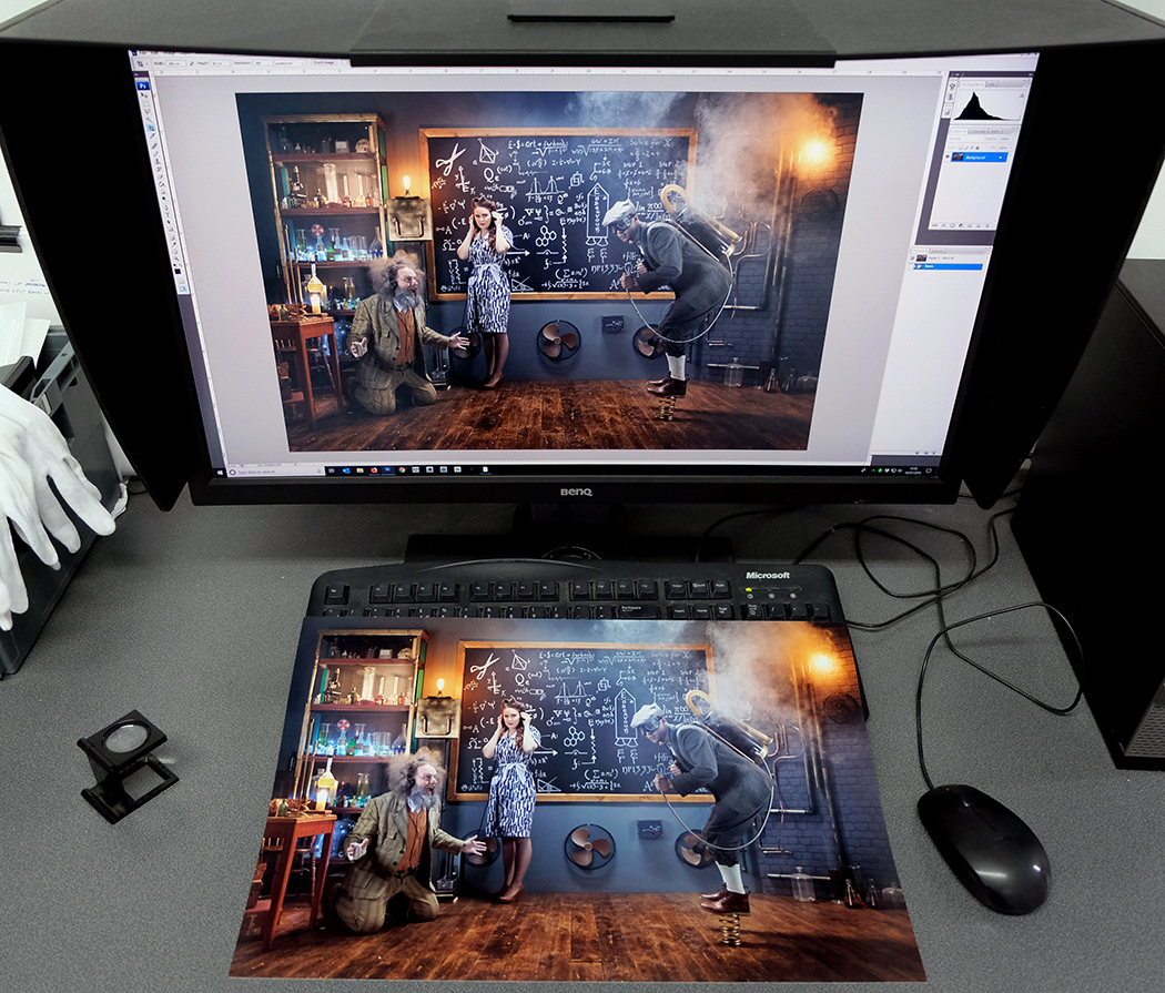
Well, that’s a big question, it is a vast subject, but one which we will try to outline simply here in terms of getting the best results from what you see on your monitor to what is reproduced on a print. So, what this blog aims to cover is how to control your working environment and procedures, so that when you require prints from your digital files you receive back prints that match the colour and density of what you have seen on your screen, as closely as possible. Our Lab Manager Jeff Heads talks us through the whole process and explains how to get the very best prints from your files.
Colour Management for Photographers
Firstly, it must be realised that because of the differences in the nature of monitors and prints there will never be an exact match. When viewing an image on a monitor your eye is seeing transmitted light whereas when viewing a print, the eye is seeing reflected light. Transmitted light from a monitor can produce a much greater range of contrast and colour intensity than images printed on paper, which depend on reflected light.
Another variation is that all devices, including paper types, have a different range of colours that they can reproduce. This range is known as the gamut. Your monitor will probably display a wider range of colours than the printer and paper combination can produce. Some colours will be fine but those that aren’t possible to reproduce are known as “out of gamut”.
So, working with these variables and limitations in mind, we need to try to work in a method that gets your print looking as close to the image that you see on your monitor as possible… which is essentially what Colour Management is.
Monitor Calibration
Most monitors come out of the box with factory default settings that are set too high in terms of brightness, contrast and colour. This is done by the manufacturers so that their monitors look as good as they possibly can without taking into consideration what they will be used for. We’ve all been in a TV shop where the screens look totally different in terms of colour, brightness and saturation, well monitors are exactly the same. As a result of these settings here at Digitalab, and indeed at all photo labs, we frequently receive files that are too dark, too flat and with a lack of colour saturation. As a photographer, you can make many colour decisions on what you are seeing on your screen but without knowing how accurate the screen is. The aim of monitor calibration is to get everyone in the same ballpark in terms of colour temperature, brightness and gamma (tone curve/contrast).
There are several devices available to buy which will do this for you. The most popular of these include the Datacolor Spyder, the X-Rite ColorMunki and the X-Rite i1 devices. These come with a colorimeter which measures the output from the screen and software for your computer which works with the colorimeter and calibrates the display and produces an ICC profile. Some of the cheaper calibration devices will promise you more than the actual produce, so we would recommend sticking to the higher-end types, like those previously mentioned. All monitors can be calibrated, but a high-quality screen will produce better results and some are designed for colour accuracy as opposed to others which are just designed for all-purpose use at home or in the office.
Most monitors designed for image editing will have a gamut close to the Adobe RGB colour space, others closer to sRGB and laptops, which many of you might use, will have an even narrower colour gamut.
Some of the calibration devices will also measure the ambient light for you. This is another variable factor when viewing your images. For best results, your monitor should be the brightest light source in your working area. You should also avoid any light falling directly onto your monitor, so working with a monitor hood is always advisable whenever possible.
Some of the calibration devices will automatically set the following targets for you, others you might have to set manually. If you do need to do this manually then setting your monitor up initially before you begin the calibration then the following settings are recommended. A colour temperature of 6500K is a good starting point, which is close to general daylight and also the colour temperature that the sRGB and Adobe RGB (1998) working space profiles are based around. Gamma/tone curve should ideally be set at 2.2 and Luminance somewhere between 80-120 cd/m2 (depending on the ambient viewing conditions).
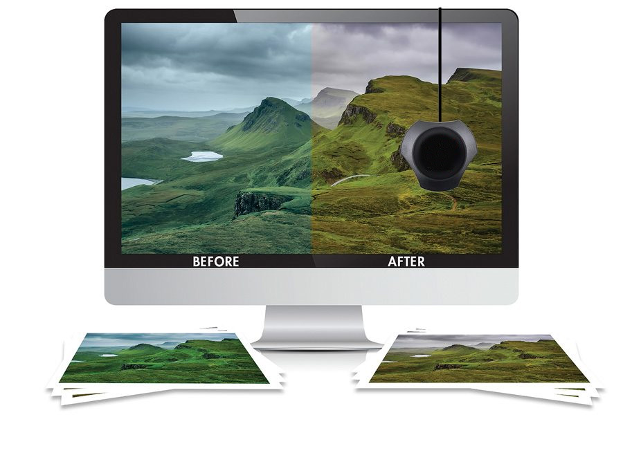
Getting your monitor calibrated so that it displays accurate colour is the first step to matching your screen to the print output.
Does all that sound too much for you? If so, then we can send you a Monitor Calibration file and a print from that file so that you can compare your monitor to the print and then adjust your monitor to match the print.
Working Space
We often get asked which working space you should use. All our C-type digital photographic printers work in sRGB, so as a general rule of thumb, we would normally recommend using that. If preparing files for our Giclée prints then you can use the wider Abobe RGB (1998), although sRGB is still fine for those too. Please do not send us files in ProPhoto, this has a wider gamut than printers can reproduce, as this usually produces prints that are dark and desaturated. If you prefer to work in ProPhoto then make sure that you work in 16-bit as otherwise, banding may occur. You will then need to “Convert” the file to sRGB and to 8-bit before sending the file to us to print.
Once you have a calibrated monitor it is always best to then send us a file to print as a test. Once you receive the print back you can then check how close the monitor and print match up. As previously explained an exact match between monitor and print output will never be achieved due to the difference in viewing the transmitted light of a monitor and the reflected light of a print.
Printer Profiles and Soft Proofing
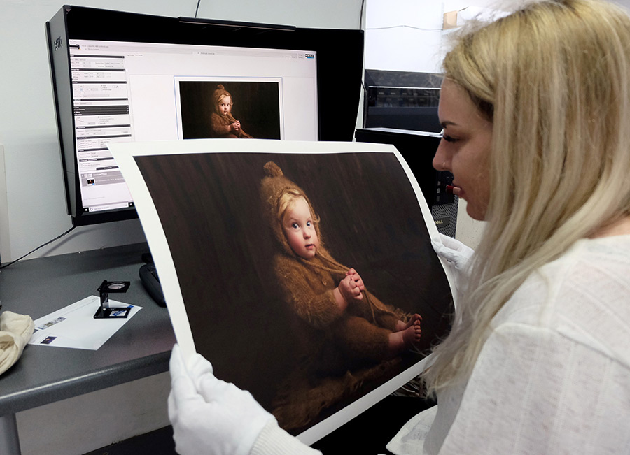
Once you are satisfied that you have calibrated your monitor as accurately as possible you can then use our Digitalab Printer Profiles to “soft proof” your images. At Digitalab we have created a Profile for each type of Printer and Paper combination that we use. These profiles allow you to see more accurately how your image will print depending on what paper you decide to use. Our Printer Profiles can be downloaded from our website here:

Once you have downloaded the appropriate Profile you will need to install it on your PC or Mac. Once installed it can be then used in Photoshop to see how your image will reproduce on your selected paper type. Depending on the type of paper you are going to output you might need to adjust your file before sending it to us to print.
To Soft Proof an image in Photoshop go to View > Proof Setup > Custom. This will then open up this window.
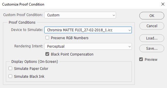
In “Device to Simulate” choose the Printer Profile of the paper that you want to print your image on. In the example above we have selected the Fujifilm Matte paper, printed on our Chromira large format photographic printer. Please set the Rendering Intent as “Perceptual” and have the Black Point Compensation box ticked. Leave the Display Options unchecked.
So, for example, when viewing the “Soft Proof” version you might see a change in contrast or a certain colour might need adjusting to get it looking how you saw it before going into the Soft Proofing view. Once you have the image looking as you want it then it is advisable to save this version with the paper type in the file name. When you are soft proofing you can also check if any colours will be out of gamut on that particular paper by going to View > Gamut Warning… anything that is out of gamut will be highlighted in grey. To bring certain colours within the gamut of the paper often the best way to make adjustments is doing so in Hue/Saturation.
A good workflow option is to work in sRGB and edit your image and save that image once you are happy with it. If you then soft proof it and make adjustments so that the file looks correct on the selected paper type. When you have done this, it is a good policy to then save that adjusted image again with the paper type added to the file name. Then you have the original file, which you can return to if you want to print on another paper type, and a file optimised to print on your chosen paper type. When you save the image please embed the sRGB profile and not the paper profile.
Order your professional photo prints today
All of our prints are produced by skilled printing technicians here in our custom-built pro lab. We provide the very best, high-quality professional photo prints at economic prices. Transform your digital files into stunning prints that will last for generations to come.