A New Look For Digitalab
Digitalab recently celebrated its SEVENTY SECOND birthday this month and we couldn’t be more excited to enter our seventy third year in business and beyond.
Our current logo has been with us in various forms since our relocation to the Ouseburn area of Newcastle in 2007. For a design that’s seen us through so much radical change in the industry and the growth & evolution of the lab itself, it feels like such a familiar presence to us all here and our fantastic customer base.
It is always of the utmost importance however, for a brands identity to represent the core values and ‘soul’ of that business. Over the past five years Digitalab has grown and evolved at a staggering rate with a drive to constantly review all aspects of our business and implementing improvements and additions to our service. We’ve honed in on our client’s needs, evolved and expanded our product range, reinforced our commitment to the industry by locking down our site and our community and marketplace have grown tremendously. You may have noticed quite a bit of change of the look and feel of our website as we roll out this rebrand and it felt like the right time to take a closer look at our logo, what it represents and give it some TLC.
The Digitalab community is a diverse collection of professional photographers from all walks of life and representing so many different genres. A multitude of creators and business owners at different stages of their careers. All of our amazing customers have one thing in common though: they work constantly to grow their skill set, evolve their work and grow their businesses. Elevating the level of design and aesthetics within our own brand is our way of reflecting the quality of the work our community puts into their own businesses, and embodies that spirit of growth.
The most important aspect however is we’re still us! Still the same team that has always been there as the print partners of your businesses, Still continuing to innovate with new products and services and still the same team that you can always pick up the phone to and discuss any aspect of our business. We’re on a mission to help photographers around the world turn passion and skill into opportunity, and with this first step of our visual overhaul, ushering in a new era for Digitalab to do just that. Without any further delay we’d love to introduce you to our new logo and visual identity!
The Process
Step 1: Make it legible!
Our previous logo’s have captured the look and feel of the lab at that point in time and served to represent the business over the years. From the early days of MPS to moving into a new, purpose built building in 2007 and rebranding to Digitalab. The Digitalab logo itself has undergone some radical alterations over the years, again, moving with the times and encapsulating the look and feel of the lab at those times. Around ten years ago the tag line of ‘professional photo lab’ was added to the logo and survived through to the most recent ‘blue dot’ version. Whilst we very much are a professional photo lab it does excluded a HUGE portion of our business that we wanted to focus on in this rebrand. Over the years it has also become apparent that there were some legibility issues in from smaller print up to exhibition stands. The new logo needed to be both readable at small sizes and have real impact at large sizes.
With the abbreviated company name we also needed to make sure it is easily read from any viewing distance so a larger emphasis on space between the letters was essential.
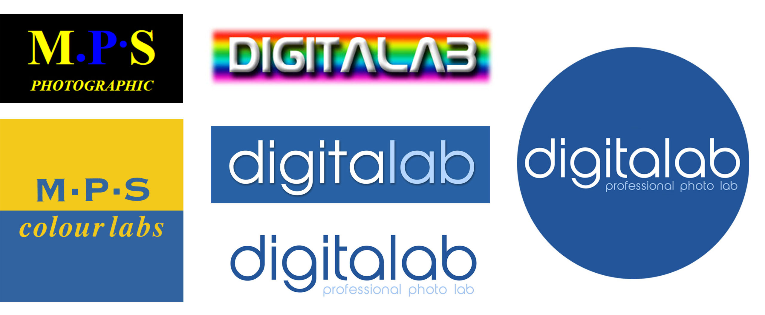
Our brand identity through the years
Step 2: Putting us in the Frame
By far one of the largest parts of our business and one we have won so many awards and praise for is Wall Art and Framing which was completely neglected in our previous logo. We needed to show some love and pride in this essential part of our offering so the frame needed to make it into the logo. A simplified outline of frame and inner mount was introduced and rotated onto one of its points to create a more engaging pair between logo and text.
Step 3: Giving Print and Wall Art a boost
The original logo keeps the same font between the ‘Digitalab’ and ‘professional photo lab’ with most versions having a slightly different colour option between the two. In the revised logo, we set out to both give a more balanced representation of our product and making this part of the logo stand out from the company name.
We created a sharp contrast between the serif and more decorative ‘DIGITALAB’ and the sans serif ‘PRINT & WALL ART’. The first is who we are – the second is what we do and people need to know this at a glance.
Step 4: Colour Neutrality opens possibilities
The blue of the original logo (first the text and then in the more familiar ‘blue dot’) whilst standing out in almost any situation it did limit us at a design level for our promotional material, web assets and marketing literature. Having the logo a single dark grey or white depending upon background gives us so much more creative flexibility. Whilst keeping (a tweaked and updated) blue for a number of situations such as social media and letterheads for continuity, we can now use our logo in a host of new ways. Combined with an updated colour palette throughout our website, promotional material and exhibition stands we now have an identity more closely aligned to our customers.
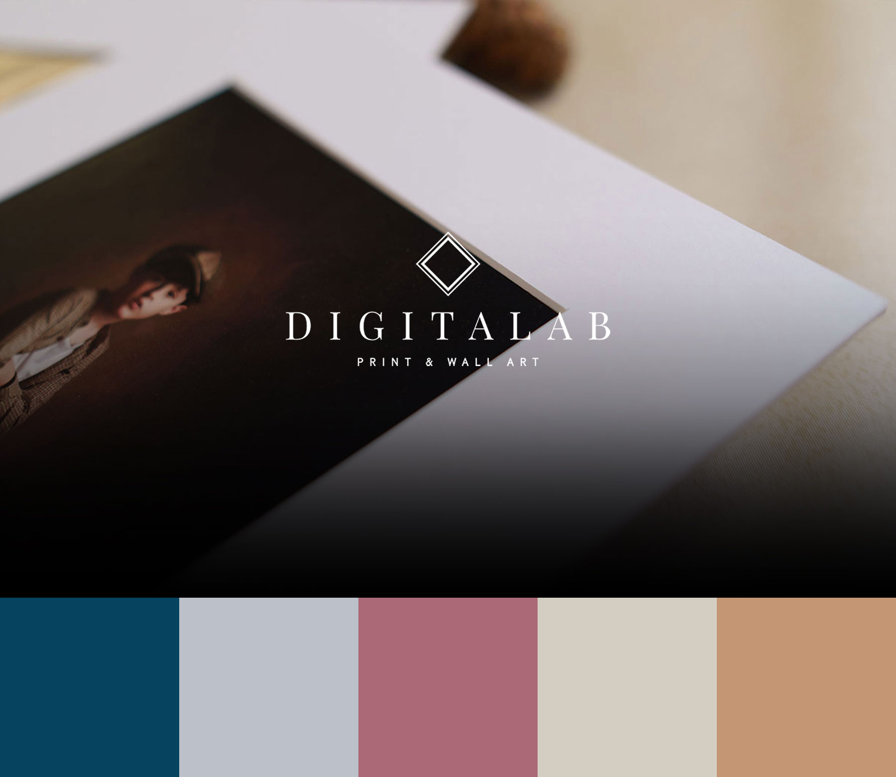
Our new logo and colour palette
Ta Da!
before-and-after
Introducing the new Digitalab logo! After a considered process and many tweaks and versions which were just not quite there, our reimagined logo has a cleaner, more elegant look that fits the ethos for the new era that we’re ushering in at Digitalab whilst celebrating the previous 72 years of our company and the work from all concerned to get us to this point. We hope you are as excited as us to see what the future of the company has in store!
